| |
About the weather
8 June 2012 • Ype Wijnia
risk management
Last weekend a report in the newspaper[1] said that Sunday the third of June would be as cold as boxing day 2011. Though, it was warm for the time of the year on boxing day. As it happened, the 3rd of June turned out to be the 3rd of June with the lowest average temperature (9,1° C) since the start of measurements in De Bilt in 1901. It seems fair to say it was a special day. However, that provoked me into asking whether the day was truly special, or that we were just looking for a perspective in which the day would be special. Even though the weather has not a very strong relation with asset management, recognizing extremes in a dataset is a vital capability. Therefore, back to the weather, as the KNMI has a wealth of measurement data available on their website[2]. It is free to be used for any purpose, as long as it is properly referenced.
The report on June 3rd mentioned an lowest average calendar day temperature since the start of measurements. The graph below shows those measurements for the past year.
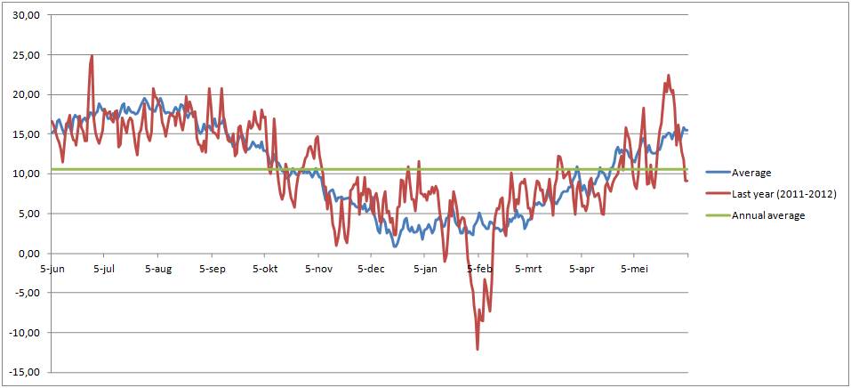
The blue line is the average calendar day temperature over the past 12 years, the red line the average calendar day temperature for the past 365 days (forgetting it is a leap year). The graph runs from June 5 to June 4 the next year,. The green line is the annual average temperature of 10,6° C.
If you look at the graph, at first there is nothing special to note. Last year’s measurement moves around the long run average of the last 12 years, sometimes with some more serious deviation like last February or the end of May. What is noticeable (though it should not be a surprise in our moderate climate) is that the average calendar day temperature can approach the average annual temperature on any given day in the year. On July 25 2011 the temperature was only 12,4 C, whereas it was 11,6 C on January second 2012 and 10,1 C on February 24. In that respect, the temperature of June 3rd was not special, it was just about the average annual temperature.
However, averages by themselves do not mean much. If a statement has to be made about the extremeness of a measurement, it has to be compared to the spread in the measurements over a longer period. That is demonstrated in the graph below.
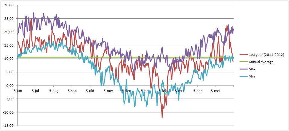
Now, one has to remember that in determining whether a measurement is an extreme, it has to be compared to a dataset of which it is no part, otherwise it can never be bigger (or smaller) than the extreme measurement in the dataset.
But again, in this graph June the 3rd does not really stand out. Apparently, in the previous year, some days around June 3rd had shown similar measurements. To be precise, on may 30th 2006 the temperature was only 8,7C, and 3 June 2001 reached only 9,7. The only thing standing out in this graph was the period of extreme cold in February this year, showing temperatures significantly below anything else for a series of days. But the rest of the year just seems to vary neatly between the extremes, with a few days outside the envelope. But on closer inspection it even shows that those days the temperatures were not really extreme, it was just that because of some coincidence that specific day showed a different measure than the days surrounding it.
This shows that what seems extreme does not have to be extreme. Volatile phenomena like the weather are different on every day and show a unique combination of measurements. If you really try hard it is always possible to find some statistic in which that combination of characteristics is an extreme. And if that proves to be impossible, it is apparently the most average day, which is an extreme in itself. Quod Erat Demonstrandum.
<< back to overview
|